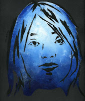
 Throughout this project I had color and line in mind for the elements of design. I made strong bold lines for the outline of my face and used striking colors for each project. In the blue picture, I wanted to convey feelings of loneliness and sadness. I used black paper with icy cold colors, and purposely spaced the image in the middle to focus on the single face. As a last touch, there are dabs of white to give off the effect of ice.
The orange face I created displayed forms of passion and happiness. I used a fun bubbly color for the background and a little bit of white for the shape of the face to give it a glowing effect. I used red paint for the center of the head to bring in warmth. Finally the strong red lines give the picture an overall intensity to show powerful feelings.

My last picture displays confusion. The dark green and magenta's were meant to contrast with each other to give the viewer a sense of uncertainty as to what emotion I tried to show. I also used dark colors of portray a dull feeling.

My last picture displays confusion. The dark green and magenta's were meant to contrast with each other to give the viewer a sense of uncertainty as to what emotion I tried to show. I also used dark colors of portray a dull feeling.
-- Jennifer Luu


No comments:
Post a Comment